NNTC’s Transformative Rebrand Journey
After two decades of advocacy, the National Native Title Council (NNTC) partnered with NGNY to create a bold new identity that would honor its past while embracing the future. The challenge was complex: develop a brand that spoke authentically to First Nations communities while maintaining the professional gravitas needed for government and industry engagement.
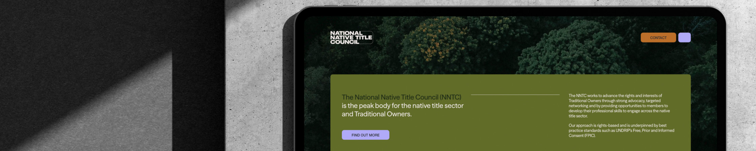
Our approach was both strategic and culturally sensitive. Through extensive stakeholder consultation, we crafted three distinct concepts that balanced cultural resonance with contemporary design principles. The winning concept, “Pools of Connection,” emerged as a masterpiece of modular design—fluid, interconnected shapes that symbolize the flow of stories and relationships across Australia’s diverse Indigenous communities.
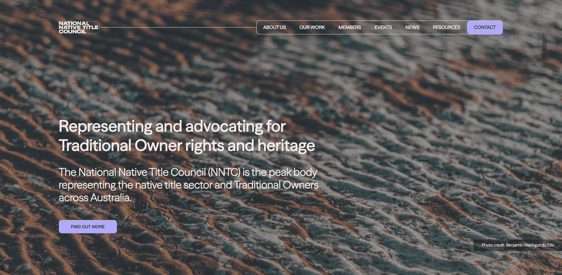
The visual identity system thoughtfully incorporated earth-bound tones of greens, greys, and ochres, grounded in nature yet uplifted by a modern purple that signals optimism and forward momentum. This harmonious palette ensures the brand resonates across NNTC’s diverse membership base while maintaining cultural authenticity.
What sets this rebrand apart is its inherent adaptability. The modular logo system allows for seamless integration of member identities, creating a unifying umbrella that celebrates diversity rather than homogenizing it. NGNY’s attention to accessibility—choosing highly legible typography and ensuring consistent application across all platforms—demonstrates their commitment to inclusive design.
The result is more than a rebrand; it’s a visual manifestation of NNTC’s evolution into its next chapter of advocacy, perfectly positioning the organization for another 20 years of impactful Indigenous rights leadership.